Responsive app
📱 What is Responsively App?
Responsively App is an open-source tool designed for web developers to test responsive web design across multiple screen sizes simultaneously in a single window.
Instead of constantly resizing your browser or switching between device views in DevTools, Responsively App displays mobile, tablet, and desktop layouts side by side in real time.
🎯 Purpose
Responsively App helps developers:
- Test layouts on multiple devices at the same time
- Instantly detect broken UI or layout issues
- Reduce repetitive browser resizing
- Improve front-end development workflow
✨ Key Features
🔄 1. Mirrored Interactions
Scroll, click, or type in one screen —
all other screens sync automatically.
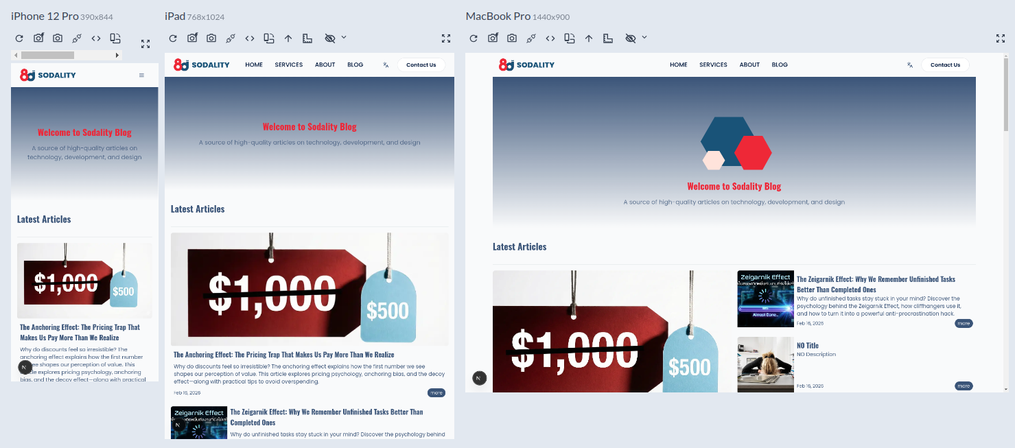
🖥 2. Multiple Devices in One Window
Simulate various device types, including:
- Mobile
- Tablet
- Laptop
- Desktop
🛠 3. Unified Inspector
Inspect elements across multiple viewports from a single panel, making CSS debugging easier and faster.
📸 4. Multi-Device Screenshot
Capture screenshots of all simulated devices at once — perfect for QA and reporting.
📐 5. Built-in Device Profiles
Includes popular preset devices such as:
- iPhone
- iPad
- Android devices
- Common desktop resolutions
⚙️ How It Works
Responsively App:
- Uses a Chromium-based rendering engine
- Simulates multiple viewports simultaneously
- Syncs user interactions across devices
- Emulates device DPR (Device Pixel Ratio)
👨💻 Who Is It For?
- Front-end developers (React / Next.js / Vue / Angular)
- CSS / Tailwind developers
- QA testers
- UX designers
- Anyone working with responsive web design regularly
🧠 In Short
Responsively App is a powerful open-source tool
that lets you test responsive websites across multiple devices simultaneously,
helping you build and debug UI faster and more efficiently.